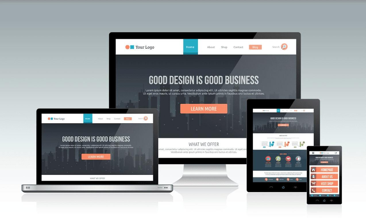
Developing a website for your company can be a difficult task; you should be aware that most website visitors leave web pages within 10-20 seconds. That amount of time is all they need to see if they have to remain engaged or add to the site’s bounce rate. Include this to the decreasing attention span of people when using the web. This scenario shows that maintaining engagement with your website is becoming harder.
For such reasons, it’s vital to take note of web design as one factor. Web design is the process of making plans, forming concepts, and organizing online content. At the moment, designing a website is more than just attractiveness and visuals. Instead, it also includes the entire site’s functionality. Web design can consist of user interface design, mobile apps, and web apps.
An example of good web designs is those that can significantly affect a site’s rankings in search engines such as Google. Also, they’re fluid in being adjustable to every kind of screen and device.
Overall, there are exceptionally great designed websites such as this platform page design that found fresh approaches to using potential designs to their favor. This is to develop experiences that various organizations wish they also had.
If you’re one of those who also want a great web design, finding inspiration from those who successfully create it can be fruitful. Read on to know more.
1. ESPN Sports Programming
ESPN elevated its sports content and programming with a dynamic and appealing website filled with large, high-resolution images and videos. The site has used background video to go with the sports network’s energy and has created transition effects and sections with a subtle hover to maintain an effortless user experience.
Likewise, the ‘featured sports’ slider is entirely alluring and does a great job portraying each sport with exciting details on existing programs and statistics.
2. FlyHyer
You don’t create a significant first impression until you show what you’re doing. But how will you indicate that you’re making a personalized aviation experience? As such, Fly Hyer’s home page did a great job.
The air-suspended airplane on the web page lays out a solid visual cue for those looking to purchase a personalized flying experience. As you attempt to go past the first fold, the airplane’s image gets larger and can be felt nearer, offering a solid impression of the airplane in action.
With that in mind, know that Fly Hyer did it correctly to make an effective homepage with a proper balance of white spaces, a gripping yet non-intrusive visual story, excellent navigation, and visible call-to-actions (CTAs). Moreover, the clean design elicits actionable feelings and motivates users to book personalized and shared airplane flights.
3. Superlist
It’s not often that you’ll land on a webpage and find a way to know what the brand is all about in one look. However, Superlist, a productivity application, acted on the principle of 5 seconds rule pretty well. If you look at the web page for 5 seconds, you’ll know the brand’s productivity between teams and people. The tool assists them in their productivity and collaboration.
As you visit the homepage, you’ll interact with the workplace accessories like pens, keyboards, journals, and headphones. Scrolling after the first fold gives way for an opened journal with a to-the-point copy.
In addition, the home page’s manifesto uses many white spaces to maintain your focus on its copy. Its ergonomically developed notification button on the top-right corner offers an immersive experience of touch and press. Also, it uses a small arrow to assist you in scrolling across the bottom of the page. There are also the captivating visual elements that go on to take over the content as you move along the first fold.
4. Revols
Revols took a risk with its web design by using macro-photography and video to zoom in on its small and modern headphones. The photography and video allowed the website to be very product-focused, so visitors became increasingly immersed in the experience these headphones provide. Also, the large font approach on Revols’ site is a nice take that contributes to the larger-than-life headphone photographs.
5. Tesla
Tesla is an environmentally-friendly and forward-looking manufacturing company. The company concentrates on minimizing the pollution that results from using fossil fuels in automobiles by manufacturing and selling electric cars.
But what about its website design, and what can you learn from it? When you visit Tesla’s website, all you’ll notice are the car options you can purchase. There are no disturbances from what you should do when you land on the website— to buy an electric car.
Furthermore, Tesla doesn’t incorporate marketing content such as reviews or car descriptions on their site, which web visitors would take a lot of time to spend. Rather, they have one-sentence copies that allow web visitors to maintain concentration on purchasing the cars.
This take of Tesla’s web design assists in the buyer’s journey because all it takes is to choose the car, click the order button, and wait for it to be sent to you. Overall, it made things easier for potential customers to buy what they wanted, which can help to increase sales.
6. Boosted
Image Source:-Web Integrations Edinburgh
Boosted brought an average skateboard to another stage by incorporating incredibly detailed images of its product alongside detailed descriptions on its site. The site’s white background and gray tones allow web visitors to retain focus on the orange CTA buttons and brightly colored skateboards they use as product examples.
Moreover, they also have a blog that looks to emphasize issues they’re trying to address with their product, contributing to the company’s excellent level of transparency.
7. Mailchimp
Mailchimp is an all-around integrated marketing company famous for its email marketing services. The company seems to have been in the industry for nearly 20 years now, and here’s what they’re doing impressively with their web design.
First, they have made use of bold colors incredibly. Immediately after landing on their site, a bright yellow color is what you’ll notice. The color contradicts the black typography nicely, allowing the text to be emphasized and seen. Likewise, the background also helps the essential CTAs to be seen—which is the phrase ‘Pick a Plan.’ This CTA button transfers you to Mailchimp’s pricing page and ‘Sign Up.’
Second, they set out the most critical content on their homepage’s front and center, with a lot of white space around it. This approach allows web visitors to concentrate only on the content. Not only that, but Mailchimp utilized a straightforward illustration to make their value proposition stand out for their customers.
8. Angel Agency
One source of inspiration for your next site launch is this small Ukraine-based design agency called Angel Agency. Its online portfolio website has an advanced yet captivating look. It’s unique because of its fun-loving cursor animation. When you hover on the text designs on Angel Agency’s home page, the texts in two colors go from right to left or from left to right as the mouse cursor moves.
Such ideas for design became very popular in previous years. You’ll find them less hard to use if you want to enrich your web designs.
9. Blueleaf
Convenience and speed have become the norm in an increasingly automated world. However, as consumers try to find purpose and empathy in everything they do, a meaningful story has become an essential feature for any brand. It’s also hard to fake—B2B brands need to work more to find their own meaningful story and look upon it as a superpower that others don’t own.
With that in mind, a world-class care home specialist Blueleaf has made a site that emphasizes empathy and strong messaging that’s valuable to everyone—a dignified and satisfying life in later years.
Overall, keep in mind that a strong message, bespoke photography, and persuasive brand promise are all required to develop a strong value proposition in an otherwise corporate environment.
10. Cap HPI
Cap HPI offers a broad range of automotive data to different personas. As such, Cap HPI has created a website, so those personas have more convenience in obtaining the type of solution they’re in search of. To set this out, they have optimized the navigation so you’ll know immediately if Cap HPI can assist your needs or otherwise.
Moreover, its website’s design, impressive color palette, and subtle animations allow for a tremendous and enlivening visual experience that you should also take as an inspiration for your site launch.
End Note
Web design is one of the critical factors for your website’s engagement and search engine rankings. As such, it’s good to find the needed examples of great website designs that can help you launch your site.
Some examples of great web designs that you can use can come from the websites of companies such as Tesla, Angel Agency, Mailchimp, and Boosted, to name some.
Overall, if you’re in an enterprise, having a well-created web design can also be beneficial in turning web visitors into well-engaged customers. And this is great for your return on investment (ROI).


0 Comments