Coming up with a great website design is more than flashy animations and awesome color palettes. There are many factors that can present challenges for even the best web designers. Creating one of the best website designs could take years of expertise as well as feedback from multiple team members. It also requires quite a bit of creative thinking to gain that unique edge.
One of the most important factors when crafting a great website is to find the right balance of high-quality design features while keeping it simple for user interaction and faster load speeds.
If you include too many flashy animations and high-quality photos or videos, then you might find yourself with a website that loads extremely slowly. This will not only hurt the customer experience and deter users from accessing your website, but it will also hurt your website rankings as website load speed is an essential ranking factor for Google and other search engines.
On the other hand, if you keep your website too simple and basic, then users may not be drawn into what you have to offer and could quickly lose interest, then head over to a competitor.
So, what does it take to create one of the best website designs?
Key Factors of a Good Website Design
- The design is consistent with the brand and logo while maintaining relevance to the target audience.
- The design clearly states the purpose of the business; defines the brand, what they do, and who they are.
- The design should pull an emotional response from the target audience and portray the proper messaging.
- The colors used in the design form a tasteful palette and do not clash with each other.
- The design, colors, and typography are consistent throughout the whole website.
- The typography is kept minimal with only a few select fonts used on the site. Often, good practice shows that two fonts should be the maximum for a website.
- The amount of colors are kept minimal and, in most cases, should consist of 5 or fewer total colors.
- There are clear and concise calls-to-action (CTAs) when building leads and sending users to the appropriate areas of a website.
- The navigation is easy to follow and users can quickly find their destination.
- The imagery (including photos, illustrations, and video) should be consistent and match the voice of the brand.
- The text should follow the natural path of the reader – going from left to right and then top to bottom.
- Get an SSL certificate for the website to ensure the website is safe and secure for users, especially on an e-commerce site.
- The load time of the website is optimized to load under 2 seconds which includes optimizing all images, video, and files that make up the design. The exception is for websites that are telling a story or leading a user on a journey through the use of beautiful, custom animation.
The examples that we have included here are some of the best websites on the internet. These developers have gone above and beyond to implement these important principles in their designs. Notably, their work in international web design showcases how diverse user needs and preferences can enhance overall functionality and appeal.
15 Best Websites on the Internet
Keep in mind that these websites were chosen by one of our writers and while there are thousands of incredible designs on the web, this is the opinion of our design editor and may not reflect the opinion of others. There is no particular order to the best websites we have chosen. We have taken into account several different variables including creativity, functionality, user experience, and industry to highlight a diverse collection.
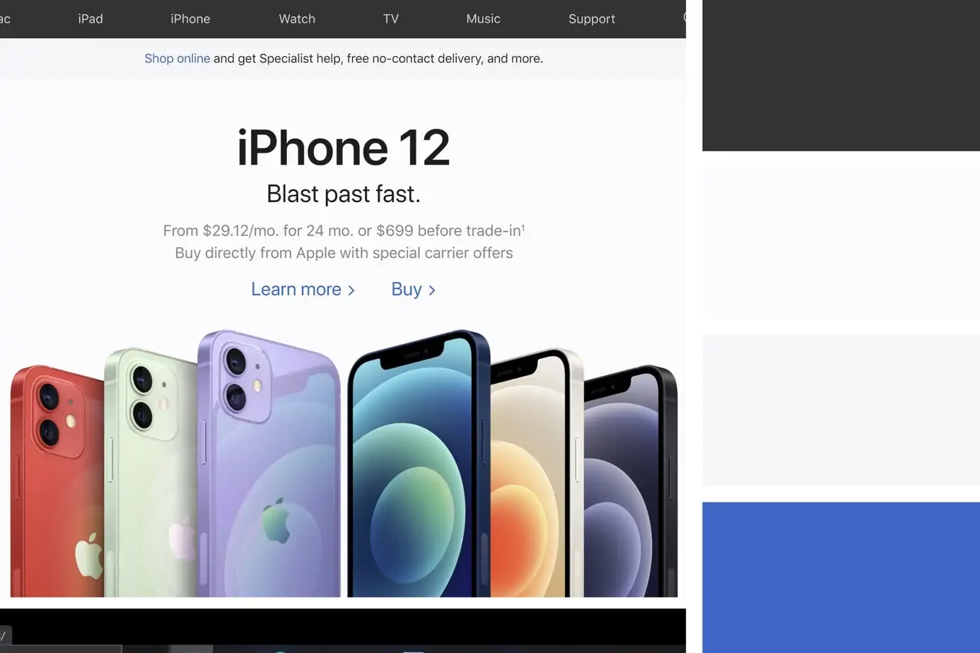
1. Apple
Futuristic | Elegant | Simple
Color Palette:
- Jet – #333333
- White – #FBFBFD
- Cultured – #F5F5F7
- True Blue – #3E66C5
- Black – #000000
Apple is the top-notch example of how a team can perfect a design in the technology industry. It takes a simplistic approach allowing the user to focus on the brand’s message without distraction. They portray the features of their products in a compelling way that is clear and to the point without crowding the screen with too much text. The page is split up into various sections that make inspiring use of imagery with calls-to-action (CTAs) that lead a user down the sales funnel.
If you are looking for a simple and elegant design that uses imagery to tell a story, then Apple is the perfect example to get your creativity flowing.
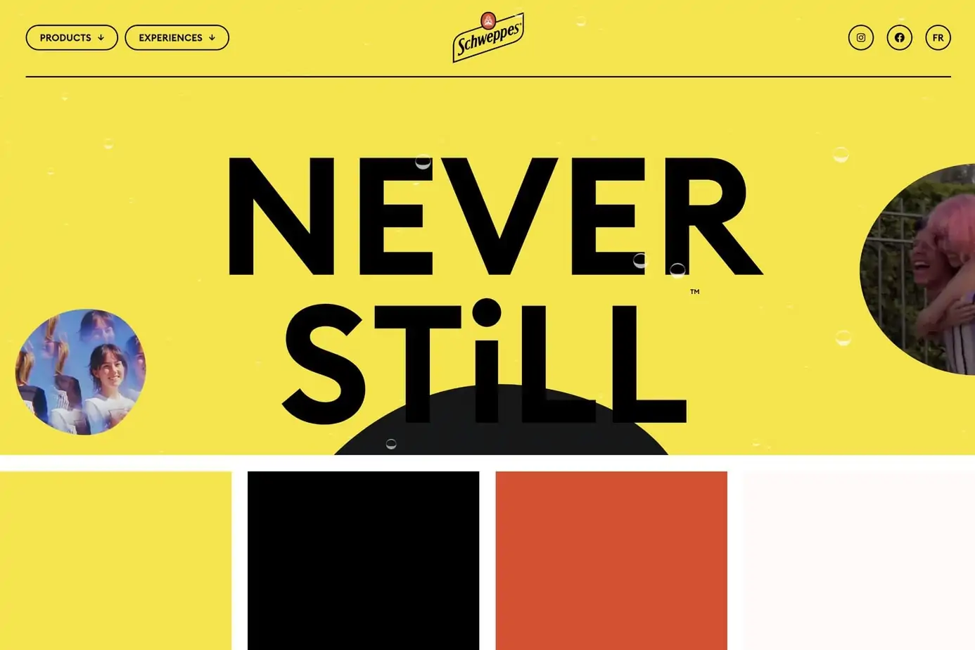
2. Schweppes Canada
Funky | Animated | Unique
Color Palette:
- Minion Yellow – #F5E44E
- Black – #000000
- Vermilion – #D25132
- White – #FFFFFF
Schweppes Canada takes a simple color palette and crafts an eloquent and beautiful design from beginning to end. Don’t be fooled by a straightforward color pairing; this website is far from simple. While the use of animations can often distract a user and slow down a website, this design takes creativity to the next level by instilling bubbly features throughout the site (which is based on their delicious sparkling beverages).
The website design takes you on a journey and places the user in what seems like the inside of a Schweppes bottle. Most sites would hurt the user experience with busy animations but Schweppes does just the opposite – it takes the user on a joyful and bubbly adventure and projects a message of excitement and celebration.
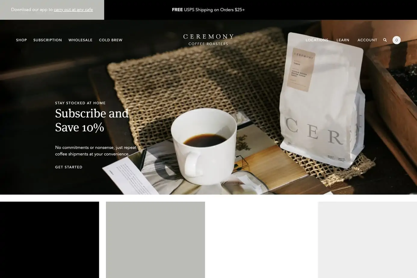
3. Ceremony Coffee
Minimal | Tasty | E-Commerce
Color Palette:
- Black – #000000
- Gray x 11 Gray – #BBBCB7
- White – #FFFFFF
- Cultured – #EEEDED
This design uses a classy grayscale palette for the main elements and incorporates a variety of other colors that stay true to the earthy theme. Rather than list each coffee roast with a picture of a label, they decided to think outside the box and add vibrant photos of items that depict the strongest flavor profile for each variety. They also have a neat way of displaying the acidity, flavor notes, and roast details without having to scroll down through each product.
Ceremony Coffee is an excellent example of how you can incorporate many colors without straying from the central theme. Each color complements the central earthy theme and provides an excellent user experience. The animations are kept simple and smooth and to top it off, they have a unique application that allows the user to select a color to learn about that particular coffee blend and choose a product from that selection.
4. Indiegogo
Minimal | Clean | Fast Loading
Color Palette:
- White – #FFFFFF
- Telemagenta – #C83674
- Jet – #2A2A2A
- Cultured – #F5F5F5
Indiegogo is one of the top crowdsourcing platforms on the web and has been bridging the gap between new innovative products and people looking for brand-new technology before it hits the mainstream. What we like about this website design is that it keeps a simple profile with a basic color palette and fast loading speeds. This is important when it comes to crowdfunding as a slow loading speed could deter early adopters from making a final purchase. Not only that, but they want to encourage users to browse through the various tech products without having to wait to load each webpage.
This website design focuses on the user experience and provides them with a straightforward journey with clean navigation and calls-to-action in all the right places.
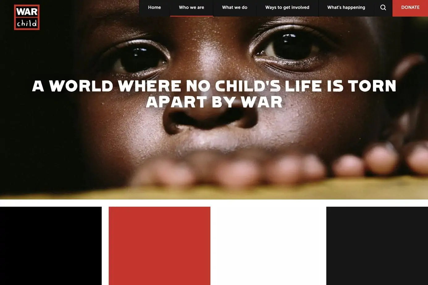
5. War Child
Unique | Textured | Bold
Color Palette:
- Black – #000000
- International Orange – #C3362C
- White – #FEFEFE
- Eerie Black – #161616
War Child is a non-profit organization based out of the United Kingdom that has the goal of offering protection and education for children that are caught up in war. This website design has an incredible blend of imagery to match a bold font and color palette. One of our favorite aspects of this site is the typography, which matches their bold mission to provide help for children affected by war.
The main headers utilize a font called “PiS LIETZ Lindham”, which was a popular font used for large-scale advertisements with bold messaging – often used for pro-communism propaganda posters.
This website design is one that screams boldness and drives the user to act. The brilliant mix of war-torn colors, unique typography and grungy background textures make this design very memorable. War Child is an incredible example of how you can use the right mix of features to pull at users’ heartstrings and get people to act.
6. Prometheus
Unique | Storytelling | Animation
Color Palette:
- Champagne – #F1E5CF
- Linen – #F8F0E3
- Jet – #403C39
- Cedar Chest – #CB563D
- Spanish Gray – #A09B95
Prometheus is a business with the courageous goal of eliminating all oil and gas by creating zero net carbon fuels from carbon dioxide in the air. This website design features some incredible animation that tells a compelling story of a business that has a mission to fight the climate crisis.
The homepage of the website loads a colorful and interactive animation that takes the user on a journey through their vision through a story beginning with Chapter 1: Fuel from the Air – which paves the way to an incredible and fun experience to learn about their mission to create fuel from CO2 in the air.
While it takes a while for an initial load, it is well worth it as the story advances through each scroll of the mouse – always staying above the fold. For those looking for inspiration in telling a compelling story with colorful and impressive animation – look no further than this unique adventure of a design.
7. PomerLeau
Minimal | Clean | Fast Loading
Color Palette:
- Rich Black FOGRA 39 – #090A0C
- Isabelline – #F1EEE9
- Blue Crayola – #4C7FF5
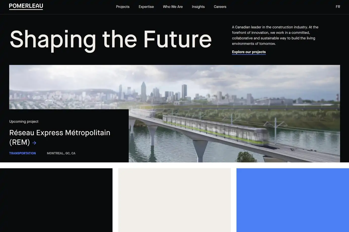
Pomerleau is a Canadian company that is an innovative leader in commercial construction. Their website is just as impressive as their projects and the design is an glaring example of how a business can showcase its work in a simple and elegant fashion. The color palette is based on just three colors and keeps the design focused on the imagery and statistics.
The most impressive feature of this website is the clever and subtle use of animations that do not compromise the loading speed or user experience. Many of the images have responsive features that make this site visually pleasing without distracting a user from their message.
If you are looking for an example in the architecture and construction industry, then this website design is an excellent example of how to build a high-speed website using large images and animations.
8. Teespring
Minimal | Clean | E-Commerce
Color Palette:
- Cerise – #CF4262
- White – #FFFFFF
- Space Cadet – #2A275E
- Xiketic – #161622
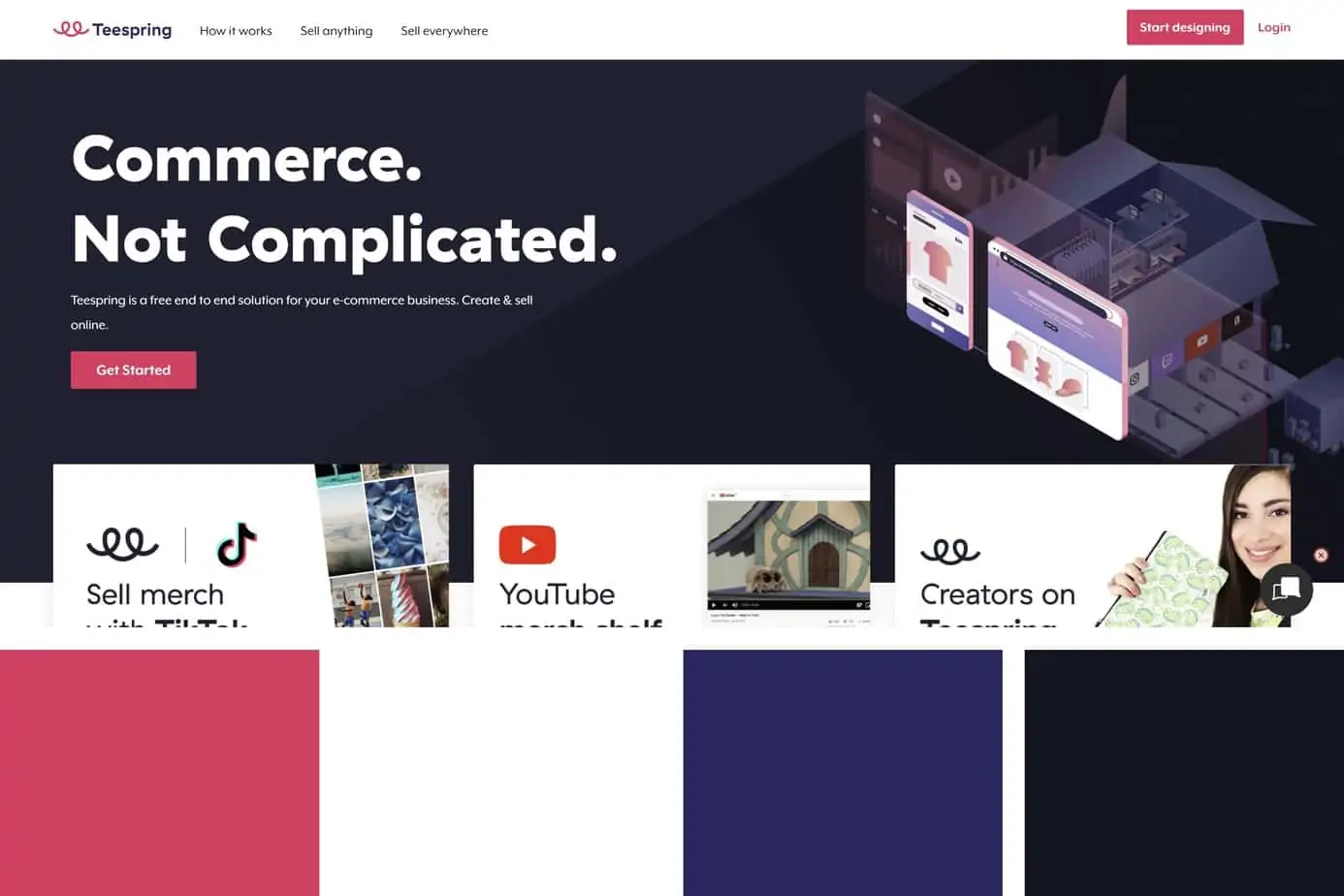
Teespring is an e-commerce platform that allows users to create unique designs for merchandise and sell it through their advertising channels. The slogan “Commerce, Not Complicated” rings true for not only their platform but their website design as well. The front end has simple navigation and makes good use of gradients on various pages to give it a fresh and trendy look, without feeling busy.
While the front end of the website for new users is impressive, it is the design launcher that really stands out and separates this website design from others in the custom merchandise industry. It sticks with a white background and dark text to focus on what matters – which is the functionality of the application which allows a user to design their own merchandise. Crafting a piece of apparel with your design has never been easier and the platform gives you a high-quality visual representation in real-time. It even shows you the profit per item, which is dynamically created when entering in your desired pricing.
If you are looking to build a website with a simple design but robust functionality, then Teespring is the perfect example for some motivation.
9. Spire
Corporate | Clean | Interactive
Color Palette:
- Cultured – #F4F4F4
- Rufous – #A52617
- Rick Black FORGA 39 – #06060E
- Gainsboro – #E1E1E3
- White – #FFFFFF
Spire is a global data network that collects information on the earth and environment through a vast network of nanosatellites with the goal of using this information to help build a better planet. They present their solutions with an incredibly balanced website design – with visually stunning animations and a clear direction. If that’s not enough, the website is able to support this with a fast-loading speed that is not often seen with this level of interaction.
The typography is a strong win for this website design with the Exo sans serif typeface from Google Fonts. It portrays a futuristic and geometric feel which fits perfectly with a business dealing with global space-powered nanosatellites (which just sounds like future technology).
For those who are looking for inspiration in the corporate or technology sectors, Spire will help launch your ideas into the stratosphere.
10. Middle Child
Clean | Quirky | Fun | Tasty
Color Palette:
- Bud Green – #61B45C
- White – #FFFFFF
- Jet – #343434
“You can’t possibly design an amazing website with just three colors.”
Middle Child – “Hold my Sandwich…”
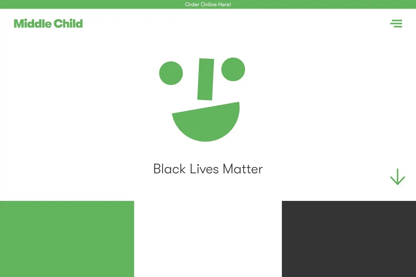
This Philadelphia sandwich shop proves that greatness doesn’t have to be complex. Middle Child comes up with a design that is spacious, simple, in-your-face, and beautiful. The text is large and friendly. The pictures are incredibly tasty. When scrolling through each page, the website flows through in an elegant and fun manner and even makes use of a joyful sandwich GIF near the footer.
This sandwich shop’s design is far from the ordinary, using language that is fitting for the city and even goes as far as labeling the city as “Philly” for their shop location. We are not sure if this was intentional, but we find a fun hidden easter egg with their mobile “hamburger” menu that is also featured on their desktop version.
If you are looking to break down the barriers of “normal” and be different while maintaining a fun atmosphere, then Middle Child is a fantastic website for inspiration.
11. Ark Shelter
Minimal | Video | Experience | Large Images
Color Palette:
- Black – #000000
- White – #FFFFFF
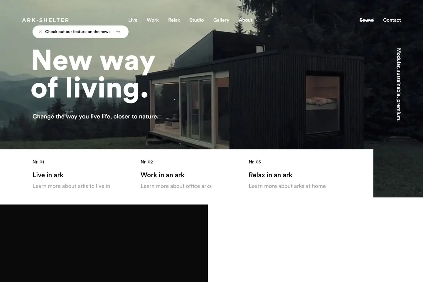
Ark Shelter is a Belgium company that creates prefabricated, fully furnished modular units that are marketed as having incredible mobility to place in remote locations. The message is geared towards those looking for a pre-made solution for housing placed closer to nature, whether that be by a lake, deep in the forest, or on a mountainside.
The website design is minimal, only using black and white tones to keep users engaged in the high-quality photos and videos. Each piece of content portrays a peaceful life in nature that can be obtained by living in one of their units, which is beautifully expressed in each shot.
If you need to be inspired by a website that shows how a business can send a message through the use of beautiful imagery, then Ark Shelter is an excellent place to start.
12. Bite Toothpaste Bits
E-Commerce | Shopify | Beautiful
Color Palette:
- Picotee Blue – #1B248D
- Space Cadet – #1E2444
- Lavender Web – #D6D9E8
- Ghost White – #ECECF4
- White – #FFFFFF
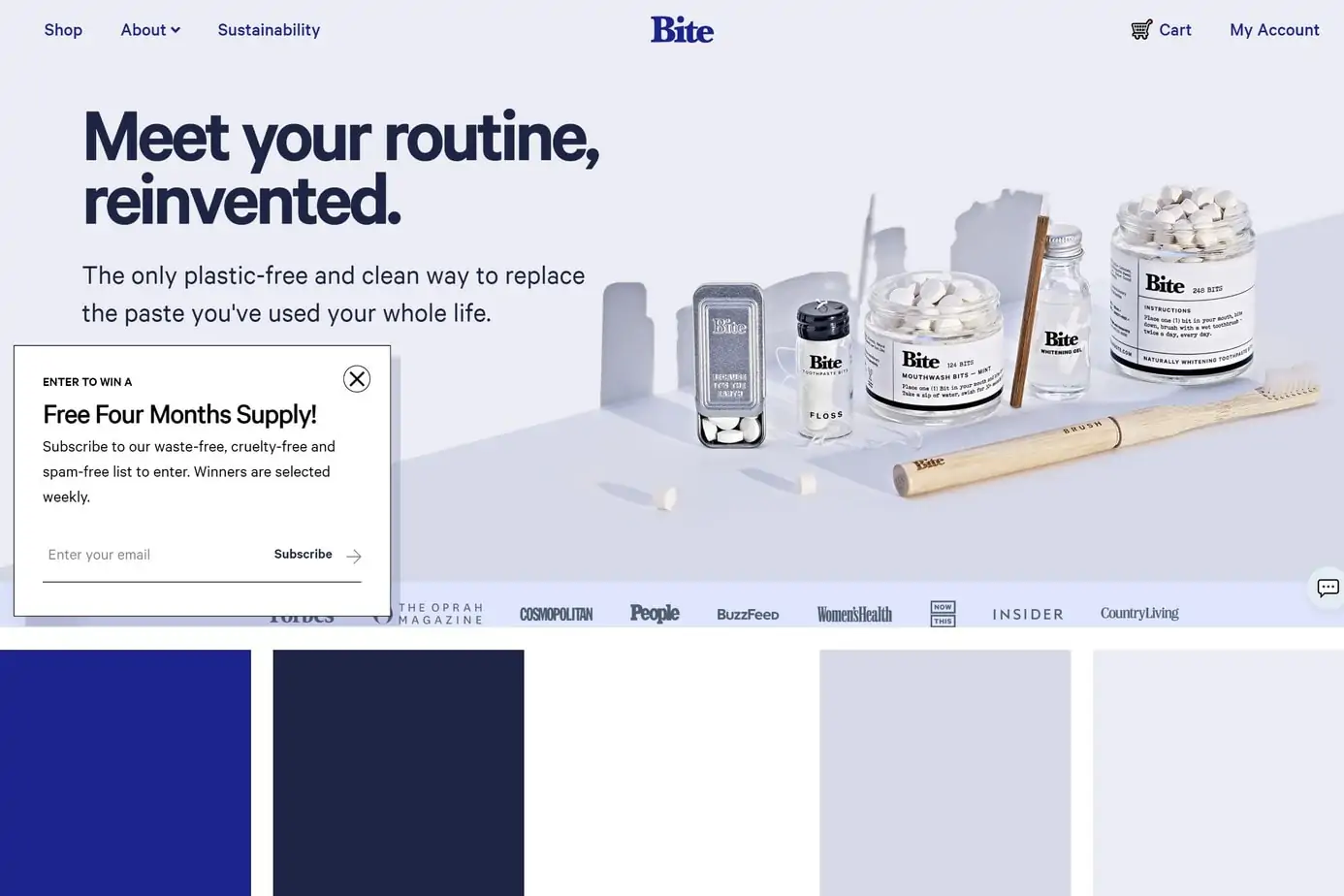
Bite Toothpaste Bits is a company that creates toothpaste in the form of bite-sized “bits”. This business revolutionized the way people use toothpaste with a new method that is plastic-free (and tasty)!
This website design proves that the Shopify platform can be extremely customizable to create a unique experience that is both user-friendly and visually stunning. While they use many different colors and filters throughout the site, they all circle back to the central theme while maintaining the right amount of white space.
From the smooth scrolling animations to the incredible imagery on hovering each product, this brand has redefined how a Shopify website can be crafted. It is through the use of animations and powerful words that they portray their message of reducing plastic waste through an innovative way of brushing our teeth.
If you want to build a Shopify e-commerce store that is unique, then Bite Toothpaste is the motivation you need.
13. Travelshift
Travel | Interactive | Beautiful | Unique
Color Palette:
- White – #FFFFFF
- Mindaro – #D8F898
- Indian Red – #E05E5D
- Eerie Black – #181818
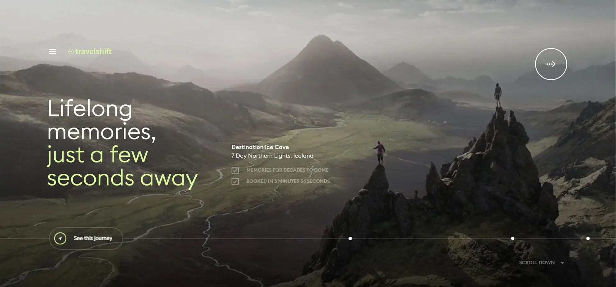
Travelshift took the travel agency approach to a whole new level with its website design. With a short initial load time, the site immediately immerses you in a beautiful and captivating experience as it places you in one of their premier travel destinations. While other travel agencies may have a slideshow or have you click through to see different destinations, this company takes you on a fascinating journey.
The cursor turns into a circle with the words “Hold to Travel”, and when held, the current destination beautifully warps away and transports you to a new exotic location.
While there are other travel agencies that have the message of “hassle-free travel”, this business goes above and beyond with its design by making you feel like you are already at the destination and ready to book at a moment’s notice.
The unique above-the-fold transitions and the mesmerizing display of images make this website one of the best in the industry.
14. Incredible Maple
Tasty | Colorful | Unique
Color Palette:
- White – #FFFFFF
- Light Coral – #E47F77
- Gold Crayola – #EEC48A
- Liver Dogs – #B36831
- Black – #000000
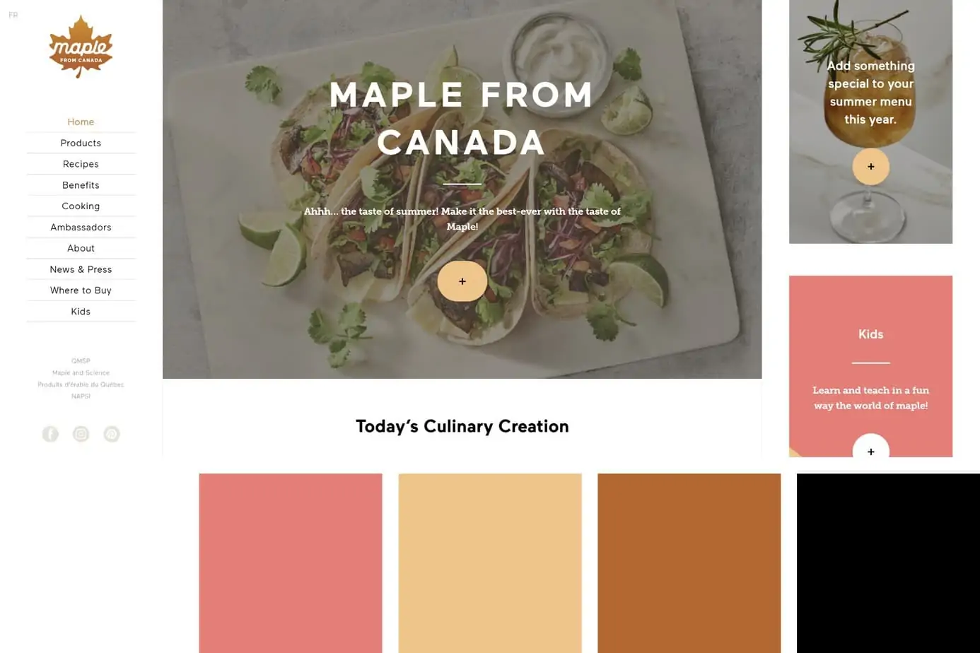
Incredible Maple, based in Canada, is a manufacturer of maple products including syrup, butter, sugar, spirits, and more. While the left side navigation is not new, it is not seen very often – especially with designs this clever. They even go one step further and include a third column on the right, making this a unique, but crafty design which complements their brand.
The color scheme matches the products with an autumn feel and the subtle parallax features really shine with a beautiful display.
This website design makes the list due to its ability to keep a fresh design with such a different structure than the “norm”. Another aspect we love about this website is the ability to continuously push out relevant content with their recipes – keeping the site fresh and giving users a reason to keep coming back for more.
15. Tens Sunglasses
E-Commerce | Responsive | Clean
Color Palette:
- Rick Black FORGA 39 – #050503
- Chocolate Web – #E1752D
- Isabelline – #F6F5F1
- White – #FFFFFF
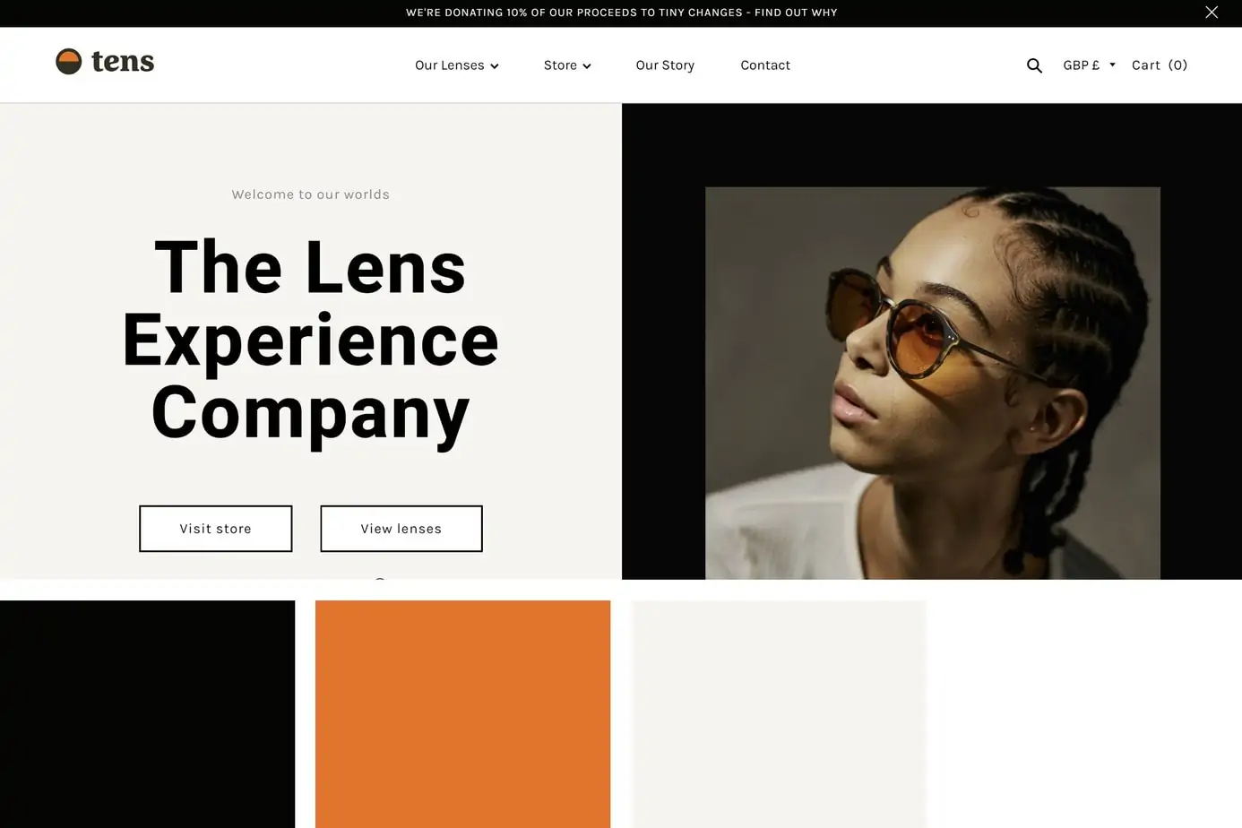
Tens Sunglasses is the perfect example of an e-commerce website that creates an excellent user experience without the extra bells and whistles. The design does not incorporate many animations like other sites on this list but makes up for it with a responsive, engaging design.
The design makes use of many different colors below the fold, but each color is a compliment to the message as they promote different colored sunglasses – each holding their own style.
Our favorite aspect of this site is their use of background video to engage the user and the unique way they create interactions while hovering over different images and products.
This website design is a fine example of how you can always provide more when selling a product to a consumer. Each product shows the style and how it can look on both a woman and a man. A simple concept, but one that seems to be easily overlooked by many companies in the fashion industry.
What do you think are the Best Websites?
Obviously, it should go without saying that we did not have the time to evaluate most of the websites on the internet. We went through many incredible websites on our journey and chose a selection that we believe represents the best elements of website design. We understand that this is simply our opinion and that everyone has a different idea of what makes the perfect design.
With that said, we would love to hear your feedback and suggestions on what should be included on our list (as we are open to keep it growing)!








0 Comments