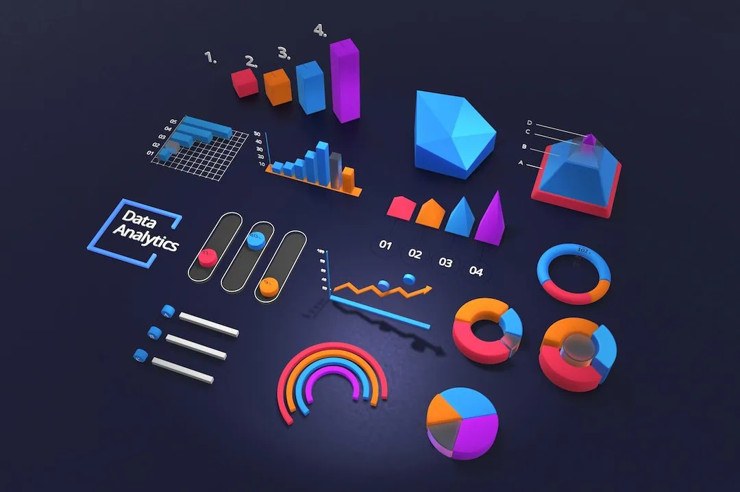
In our technologically driven era, the use of charts and graphical representations has become an integral part of data conveyance. We encounter them in our day-to-day activities, from financial reports at our workplaces to trending topics on social media. But how much do we genuinely understand charts? As a guide designed for beginners, this article aims to break down the basics of understanding different types of charts and how they can be effectively utilized. Keep reading to become more confident in your ability to interpret and utilize these expression tools.
The Basics of Chart Reading

Before we dive into specifics, let’s understand the backbone of chart reading. Charts exist to simplify complex data and trends into visual representations that can be quickly understood. However, they all serve the same fundamental purpose—to express quantitative relationships in data visually. This makes it easier to recognize and understand patterns in large datasets, to make predictions, or to understand cause-and-effect relationships.
Despite the various kinds of charts, certain elements are ubiquitous. These include a title, which gives the viewer an instant understanding of what the diagram is about, a legend that outlines what each color or symbol represents, and an axis to classify different variables. Each of these components plays a role in ensuring the viewer receives a wholesome understanding of what the chart represents.
The Importance of Selecting the Appropriate Chart Type
The selection of the type of chart to use depends heavily on the nature of the data to be presented. Not all data can be correctly visualized using any chart type. For instance, a pie chart is best suited to display the proportions of a whole. Using it to demonstrate trends over time would be highly ineffective and misleading. Similarly, using a line chart to represent categorical data would also be inappropriate and could result in a misunderstanding. It’s essential to recognize that the right type of chart not only optimizes understanding but also leads to more precise decisions based on the data presented.
Unleashing the Power of Candlestick Charts in Trading
Being an ancient Japanese trading technique, candlestick chart patterns offer a highly visual way of understanding price movements of financial instruments over time. Traders worldwide widely use them as they provide a vast amount of information in a single candlestick. These charts are quite unique as they encapsulate the market’s opening, closing, high, and low prices for a specific period—all in all, a powerful tool for predicting market movements.
However, interpreting candlestick patterns can be quite challenging for beginners. Each candlestick pattern comes with its connotations about potential market movements, which is why it is critical to understand them well.
Line Charts: Simplistic Yet Informative
Line charts are commonly used to exhibit information change over a period of time. Each point in the graph represents a data point, and they are linked by a line so one can visually observe the data’s progression over time. These charts are usually used for temporal data—when data points are evenly spaced over time. This could include anything from a company’s share prices over a year to the population growth of a city over a decade.
They are particularly useful in spotting trends and predicting future performances based on past data. Line charts can accommodate multiple lines, making it easy to compare two or more categories and observe their relative progression over time.
Bar Charts: Vertical and Horizontal
Bar charts are a great way to compare different categories. They provide a clear, visual representation of categorical data in either vertical or horizontal bars, where the length of the bars corresponds to the measured value. For instance, a marketing company might use a bar chart to compare the earnings from different advertising campaigns.
The decision to use a horizontal or vertical bar chart generally depends on the space available and the nature of your categories. If you have longer category labels, a horizontal bar chart could be more suitable as it provides more room for textual details.
Overall, charts are powerful tools for visualizing data. By understanding them more deeply, you can become better at using them effectively to tell a compelling, data-based story. As this guide demonstrates, there’s more to chart usage than just piecing together some visual elements. Whether you are a beginner or an experienced individual in the fields that require data presentation, understanding charts at a fundamental level will indeed enhance your data prowess.


0 Comments