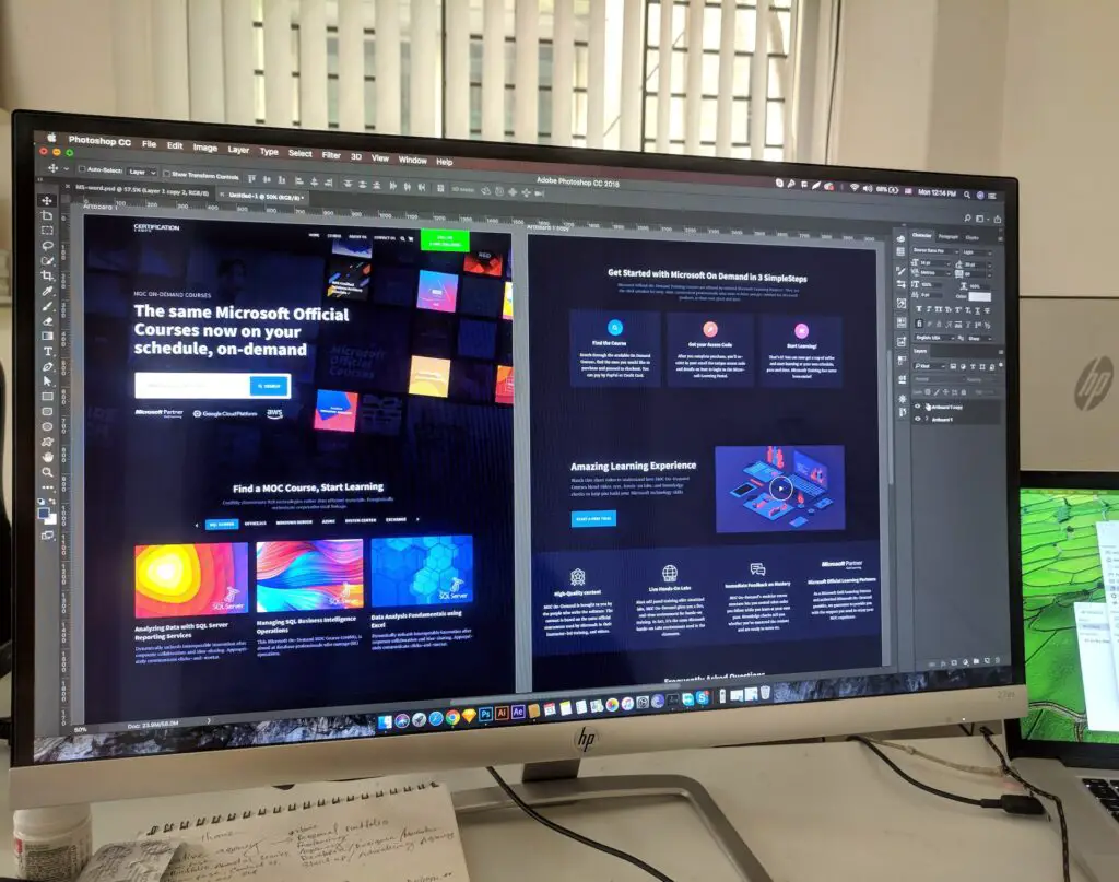
When you’re jazzing up your blog design, it’s all about making it super engaging and a total breeze to read. You want readers to feel like they’ve stumbled upon a comfy home where they just can’t get enough of your awesome content. Picture this: a blog so cozy and inviting that people keep coming back for more! So, let’s get creative and make your blog a paradise that no reader will ever want to leave! Here are some tips to help you do just that.
Have a Clean and Simple Layout
You know what they say: less is more! So, give your content some breathing space with lots of lovely white space. When it comes to website design, we’re going for clean and clutter-free vibes. No one likes feeling overwhelmed with a million things crammed on the page. Keep it simple, keep it sleek, and your visitors will thank you for it!
Make Navigation Clear and Simple
You want your blog to be as user-friendly as possible, right? That means making navigation a breeze for your readers! So, whip up a clear and logical menu that sorts and organizes your content in a snap. Nobody wants to get lost in a maze of posts, am I right? And hey, don’t forget to add a nifty search bar! It’s like a treasure map for your readers, helping them find those juicy articles in the blink of an eye.
Have a Responsive Design
When you’re putting together your blog, you have to make sure it’s ready to rock on any device out there. We’re talking desktops, tablets, and those handy mobile phones! You want your blog to shine like a superstar, no matter how big or small the screen is. That’s where responsive design comes into play. It’s like having a magical resizing potion that makes your blog look and work flawlessly, whether it’s on a massive desktop monitor or a tiny smartphone screen. So, get that responsiveness going, and your readers will be singing your blog’s praises from every corner!
Keep the Font Readable
When it comes to fonts, we want the reading experience to be smooth sailing for our awesome readers. So, let’s pick a font that’s easy on the eyes, shall we? Think of it like choosing the perfect outfit – you want something that looks good and feels great! Now, here’s the deal: those sans-serif fonts like Arial, Helvetica, or Roboto bring that extra clarity to your content, making it a breeze for readers to gobble up your words without squinting or getting lost in a sea of letters. So, say goodbye to the font confusion and hello to readability perfection!
Have Contrasting Colors
When it comes to colors, we want that perfect combo that makes reading a joyride! So, think about contrasts like yin and yang, peanut butter and jelly – they just go together, right? Here’s the trick: go for a color scheme where your text and background play off each other. Dark text on a light background or the other way around – both work like a charm! It’s like a well-choreographed dance that makes your content pop and keeps those readers hooked from the first word to the last. So, let’s paint your blog with the magic of contrast and make it a delightful reading experience!
Add Engaging Images
Imagine this: your content is like a fabulous party, and these high-quality images and graphics are the life of the bash! They’re like the sparklers that light up the night and steal the show. Readers are naturally drawn to eye-catching visuals, and these little wonders can totally captivate their attention. It’s like a secret weapon to keep them hooked from the moment they lay eyes on your blog! So, let’s sprinkle some visual fairy dust and turn your blog into a delightful feast for the eyes!
Avoid Wall of Text
You know what they say – long paragraphs are like giant hurdles that scare readers away! We want your content to be a warm embrace, not a daunting challenge. So, here’s the secret sauce: break it down into bite-sized chunks that are easy to savor! Think of it as serving up your words like tasty appetizers – readers can’t resist taking a nibble, and before they know it, they’ve devoured the whole dish! Short paragraphs make your content more friendly and less like a textbook. Plus, they keep those readers glued to the screen, eager for more. So, go ahead, slice and dice that text, and make it a delightful feast for your readers!
Use Lists and Bullets
When it comes to sharing wisdom, there’s a secret weapon you have to wield: numbered lists and bullet points! They’re like little superheroes that swoop in to save the day! Think about it – nobody wants to wade through a sea of words searching for those precious pearls of wisdom. So, here’s the trick: whip out those lists and bullets to serve up your info in a neat and tidy package. It’s like a power-up for your readers’ brains, making it super easy to follow along and remember all the key points! It’s the perfect recipe for content success – short, snappy, and totally unforgettable. So, let those lists do their magic, and your readers will be singing your praises from the rooftops!
Summing Up
Your readers are the VIPs, and we want them to have a blast while soaking up all the valuable info you’ve got to offer. So, here’s the deal: by sprinkling some design magic with these tips, you’ll turn your blog into an irresistible oasis. Think of it as a cozy retreat where visitors can’t help but linger and keep coming back for more. You’re like a magnet, drawing them in with engaging content and a reader-friendly design. So, let’s roll out the red carpet for your readers, and they’ll be your biggest fans, sharing your blog far and wide!


0 Comments